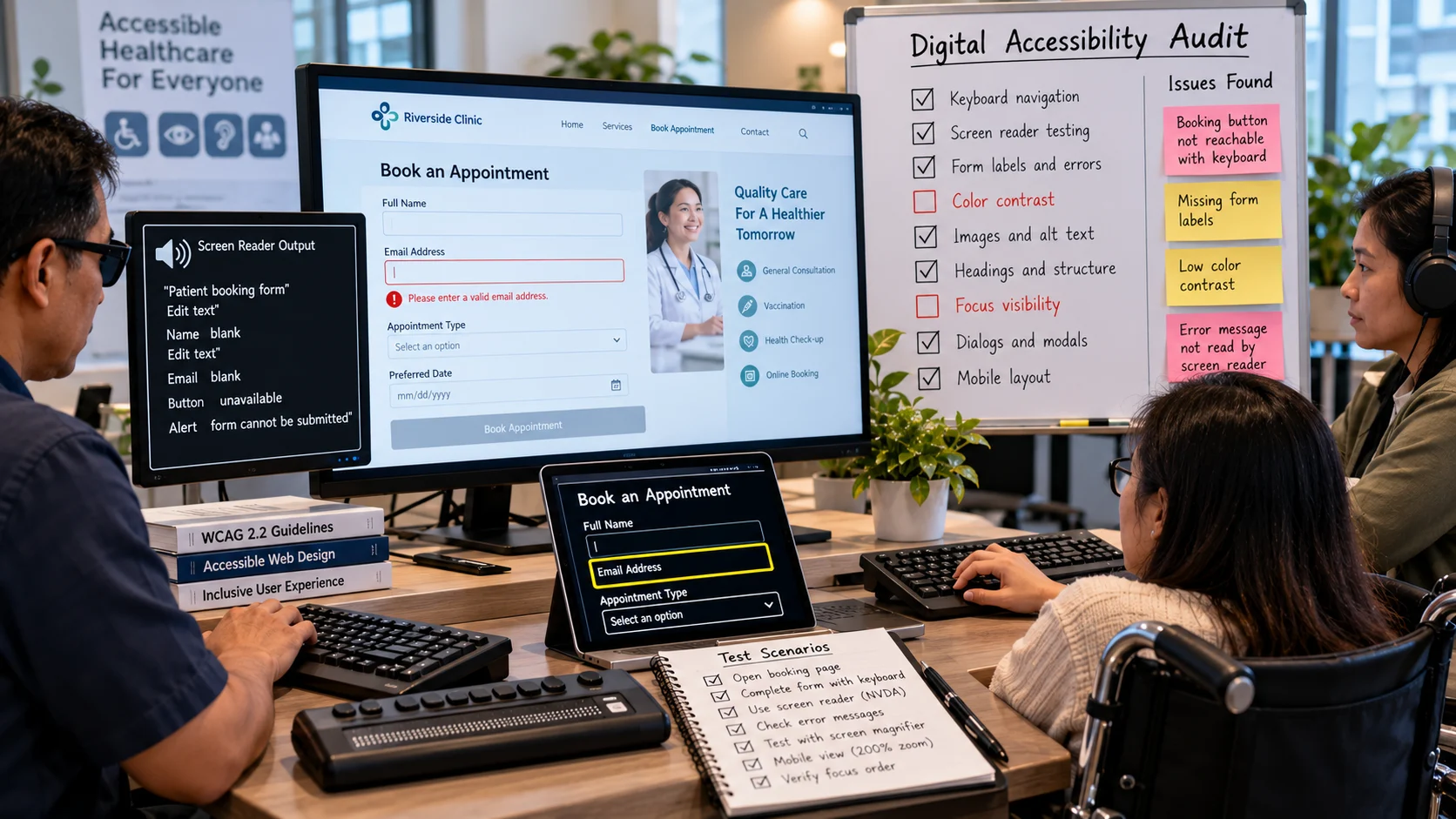
A clinic discovers that patients using keyboards cannot complete an online booking form after a site redesign. A digital accessibility audit tests whether people with varied abilities and assistive technologies can navigate and complete tasks in a website or service. It combines automated checks, manual inspection, and realistic task testing. This is an organizational audit and prioritization process, rather than a guide to using AI tools for captioning or alt-text writing. Quantitative examples below are hypothetical and should be adapted to the reader’s actual data.
Key Takeaways
An accessibility audit tests whether people can complete meaningful digital tasks using different input and assistive technologies.
Automated scanners can catch some failures, but cannot establish understandable navigation or effective screen-reader use.
Prioritize barriers that block checkout, registration, essential information, or other critical journeys.
Document the observed problem, expected behavior, relevant standards, and a reproducible retest procedure.
Repeat testing after fixes and train content editors so the same barriers do not return.
What a Digital Accessibility Audit Should Reveal
A digital accessibility audit evaluates whether people with different disabilities can perceive, understand, navigate, and operate a website or digital service. It combines standards-based checks with practical task testing. An automated scan can find some defects, but cannot establish that a form is understandable, a chart description is meaningful, or a checkout can be completed using assistive technology.
The audit should focus on actual barriers and evidence. A site that displays an accessibility score of 95 may still contain a critical booking button that cannot be reached with a keyboard. Conversely, some programmatically detected issues may need contextual analysis to determine their impact. Reporting only a numerical score can create false confidence and hide the tasks people cannot complete.
Establish Scope and Applicable Criteria
Begin by listing key user journeys: finding information, comparing products, registering, making a payment, recovering an account, or contacting support. Choose representative page templates, components, and interaction states rather than inspecting only the home page. Include mobile layouts, error messages, modal dialogs, and pages that load content dynamically.
The Web Content Accessibility Guidelines (WCAG) provide a widely used technical reference. Identify the version and conformance level relevant to your organization’s obligations and goals. WCAG 2.2, for example, groups success criteria under perceivable, operable, understandable, and robust principles. A report should reference specific criteria and explain affected user experiences, not merely label everything “noncompliant.”
Consider the audiences and technologies involved. Keyboard navigation, screen readers, magnification, voice interaction, and high-contrast or reduced-motion settings may reveal different problems. A single test environment cannot represent every user, so document the coverage and limitations.
Combine Automated, Manual, and User Testing
Automated checks are useful for missing labels, duplicate IDs, some contrast problems, and certain structural issues. They can be repeated regularly and integrated into development workflows. However, they cannot reliably determine whether the alternative text explains an image’s purpose or whether the information architecture makes sense.
Manual technical testing evaluates keyboard order, focus visibility, dynamic announcements, dialog behavior, error recovery, and content reading order. It also checks whether headings, labels, and instructions remain meaningful in context. Developers should observe the rendered interface, not rely solely on HTML inspection.
Task-based usability testing asks participants to complete real activities using their preferred methods. Where practical, involve people with disabilities and compensate their expertise. Their experiences can reveal unexpected friction not captured by a rule checker. Findings should be discussed as observed barriers under defined test conditions, not generalized as if one person’s experience represents everyone.
A Practical Audit Checklist
Keyboard and focus
Can users reach every interactive control without a mouse? Does the focus move predictably? Is it visibly indicated? Can dialogs be opened and closed without trapping someone, and does focus return to a sensible location? Hover-only menus and inaccessible date pickers are common trouble spots.
Forms and errors
Does every control have an appropriate programmatic label? Are required fields explained? When an error occurs, can the user discover the message, understand what changed, and correct the entry? Placeholder-only labels and generic “invalid input” warnings often leave people without enough information.
Visual presentation
Check text contrast, zoom behavior, reflow, touch targets where applicable, and meaningful use of color. A status shown only as red or green may be inaccessible to someone who cannot distinguish the colors. Responsive layouts should not hide essential controls when text is enlarged.
Images and media
Ensure meaningful images have suitable alternatives and decorative images do not create unnecessary noise. Videos may require captions, transcripts, or audio descriptions depending on content and applicable requirements. Auto-generated captions should be reviewed for names, technical terms, and speaker changes.
Structure and semantics
Headings should describe the document hierarchy, links should make sense out of context, and components should expose names, roles, and states. A styled div is not automatically equivalent to an accessible button. Prefer standard semantic controls where they meet the need.
Conducting an Audit in Seven Steps
Define the scope. Select primary journeys, page templates, WCAG reference, environments, and business priorities.
Create a page and component inventory. Include common navigation, search, forms, dialogs, media, and error states.
Run automated scanning. Record findings with affected URLs and screenshots or other reproducible evidence.
Perform manual checks. Test keyboard operation, focus, screen-reader behavior, and relevant content quality.
Evaluate complete tasks. Check whether users can complete registration, checkout, or another critical outcome, not merely reach each control.
Prioritize remediation. Classify barriers by severity, frequency, affected journeys, and required effort. Assign owners and deadlines.
Retest and prevent regression. Confirm each fix, update shared components, and add relevant checks to release workflows.
A well-managed audit includes an explicit retest stage. A change intended to repair keyboard focus in one dialog may introduce a new problem in another. Close a finding only after verifying that the intended user journey is improved.
Example: A Booking Form That Looks Fine
Imagine a restaurant booking page that appears modern and readable. Automated scanning flags a minor contrast issue but reports few other problems. Manual keyboard testing reveals that the date picker cannot be opened without a mouse. A screen reader also announces “button” without describing the reservation confirmation action. These are serious barriers despite the optimistic scan result.
The remediation should use an accessible date-entry pattern, clear control names, and appropriate focus management. The team then retests the entire reservation flow including validation errors and confirmation. Measuring whether a keyboard-only user can complete a booking provides more meaningful evidence than watching the automated score increase.
Writing Findings Developers Can Act On
Each issue should include the observed behavior, expected behavior, reproduction steps, affected environments, relevant criterion, impact, and suggested remediation. Provide exact control names and page locations. “The site is not accessible” is not actionable. “Keyboard focus does not enter the modal after selecting Reserve on the mobile booking form” is a reproducible defect.
Severity should reflect impact, not merely implementation effort. An inaccessible payment confirmation can prevent a critical transaction; a minor decorative-label issue may be lower priority. Group repeated defects by shared component so one design-system fix can repair multiple pages.
Where AI Can Help—and Where It Cannot
AI assistants may summarize audit findings, propose clearer labels, generate first-pass alt text, explain WCAG language, or suggest code patterns. Their output should be checked by experienced reviewers and tested in the actual interface. A generated fix can pass a superficial check while breaking focus order or interaction behavior. An AI tool cannot credibly certify complete accessibility without real testing.
Privacy matters when the audit uses recordings, participant feedback, or assistive-technology sessions. Obtain appropriate consent and limit distribution of personally identifying research notes. Do not treat participants as test data to be freely uploaded to unreviewed AI services.
A strong accessibility audit produces a prioritized backlog tied to real users and repeatable evidence. It makes digital services more usable by correcting barriers in the product, not by purchasing a certificate or declaring a scan score sufficient.
An accessibility audit beyond a one-click scan
A booking page passes several automated accessibility checks but traps keyboard focus inside a modal. A person using only the keyboard cannot finish the reservation. The audit should inspect keyboard order, visible focus, form labels, error announcement, contrast, and responsive zoom; automated scanners are useful for some code-detectable failures but cannot judge every interaction.
Finding Evidence Fix owner
Modal focus trap Tab key cannot reach close control Front-end developer
Unlabeled date field Screen reader announces “edit blank” Product/design team
Missing error summary Invalid booking yields silent failure Forms engineering
For a credible audit, record reproduction steps, affected user journeys, WCAG criteria where applicable, severity, and confirmation after the fix.
Mini keyboard-and-screen-reader rehearsal. Open the appointment calendar without a mouse, press Tab through each control, activate the date selector with Enter or Space, and close it with Escape where the interface promises that behavior. Watch whether focus returns to the button that opened the dialog. Next, intentionally submit an invalid date and check that the error is announced and associated with the field. This exercise tests the customer journey rather than relying on an automated accessibility score; document your browser and assistive-technology combination.
What the example teaches. The booking form passes a superficial automated scan, yet keyboard focus disappears when a calendar pop-up opens. A tester using only the keyboard cannot finish scheduling. The audit records task failure as a blocker and retests the corrected focus sequence rather than declaring success from a score.
Prioritizing Findings by User Impact
Not every detected issue should receive the same urgency. A missing accessible name on the button that submits a payment can block an essential task, while a mildly confusing decorative description may have limited impact. Assess who is affected, whether the task is critical, how often the component appears, and whether a workaround is available. Record priority criteria so teams do not simply fix the easiest warnings first.
Components reused throughout the website often deserve high priority. Correcting a broken navigation menu in the shared template can remove barriers from many pages. A one-off page-specific patch may be necessary for an urgent issue, but should not leave the design system capable of reintroducing the same defect during the next release.
The Difference Between Audit and Continuous Monitoring
An audit captures evidence under particular conditions. New content, plugins, forms, and interface changes can create new barriers afterward. Integrate selected automated checks into development, define manual release tests for recurring components, and establish a process for responding to accessibility feedback from users. Review the audit scope periodically as new journeys become important.
A regression test might verify keyboard access to the account menu every time the navigation component changes. A content publishing check might require reviewed captions before a video is marked public. These controls are more effective than waiting for another full audit to discover familiar errors.
Making Reports Accessible Themselves
Accessibility audit deliverables should be usable by the people responsible for reviewing them. Provide headings, understandable tables, descriptive issue identifiers, and accessible formats. Do not rely on color alone to indicate severity. Include concise examples of the user impact and clear remediation steps, so developers and business owners can act without decoding unexplained technical jargon.
A Manual Test Scenario for a Small Website
Choose a real conversion task, such as finding an article, opening its contact link, and submitting a short message. Complete it first using only the keyboard, paying attention to visible focus, logical order, and controls that trap the cursor. Next, repeat with a screen reader and listen for meaningful headings, button names, form errors, and status messages. Zoom or increase text spacing to check whether content overlaps or controls disappear. Automated tools can supplement these observations, but they cannot prove that the complete task is understandable.
For each defect, record the page, the expected behavior, the observed obstacle, the affected success criterion where applicable, and a reproducible test. Prioritize barriers that completely prevent task completion. Once developers fix them, rerun the same scenario and check nearby components for regressions. This produces an audit the team can act on.
Prioritize Accessibility Findings by Human Impact
An audit often identifies dozens of defects, and the most visually obvious issue is not always the highest priority. A missing form label can prevent someone from completing checkout, while a minor contrast issue on a decorative element may have a smaller immediate effect. Classify findings by task impact, frequency, affected users, and cost of correction; also account for legal or contractual obligations where applicable.
Publish a realistic remediation plan. Fix blockers on core journeys first, add regression tests for components used across the site, and make sure content editors understand how to avoid recreating the problem. Accessibility improves through ongoing ownership, not through a one-time badge or scanning report.
Frequently Asked Questions
W3C
It identifies common detectable issues, not every barrier. Focus management, meaningful text, and complex workflows often require human examination.
Further Reading on ByteScope
AI Design Tools
Responsible AI Guide
Sources and Further Reading
W3C: Evaluating Web Accessibility — W3C accessibility and web-standard guidance.
W3C: WCAG 2.2 — W3C accessibility and web-standard guidance.